eBay brand redesign
In early fall of 2018, eBay decided it was time to change things up. We moved away from our “Fill Your Cart With Color” brand campaign and moved toward a concept that highlights what makes eBay unlike any other shopping destination. Since this change came suddenly to the creative team, I worked with a small group to rewrite and redesign all the creative assets that were already created for the upcoming weeks so that everything would align to our new brand.
Not only did we have to create all the new assets that were kicking off at that time, but we had to recreate all the assets that were about to launch. Essentially we created a month’s worth of work in one week. We put in the extra time and effort and pulled it off. Plus, the assets were extremely successful.
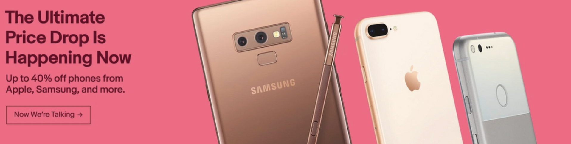
During this time, I pitched the idea of restructuring our seller-funded coupons. Our old way of building them resulted in poor user experience because customers didn’t recognize that the coupons were different from flash coupons and that the coupon code wouldn’t apply to everything in their cart. Since we had more creative freedom because the brand was reinventing itself, I argued that now was the time to fix that problem. I suggested that we only include the coupon codes on the landing pages so that shoppers have to click through to the landing page before they can use it. That way, they’ll be directed to the page with the relevant merch and a better explanation of what products they can purchase with the coupon. This set a precedent for how we format our seller-funded coupons now. The results were impressive and nearly doubled the benchmarks. The homepage banners saw a 3.11% CTR compared to a 1.80% benchmark while the email banners saw an astounding 13.04% CTR compared to a 6.67% benchmark.

Banner CTR: 3.11% vs. Benchmark: 1.80% Email Banners CTR: 13.04% vs. Benchmark: 6.67%

CTR: 1.56% vs. Benchmark: 0.93%